While all the paint companies are fighting for the hottest ‘color of the year’ title, we suggest a simpler and more effective approach. Use most of the trendy hues to mix and match them in various color palettes! This way, you’ll be able to come up with a designer-worthy scheme for your interior.
The Season of Color Awards
Fall comes with beautiful sceneries of changing foliage, pumpkin spice lattes and candle season in every home around the globe. Did we forget something? Of course, there’s countless color of the year announcements as well. From Pantone to Benjamin Moore, every paint-related company declares it’s their duty to come up with a very special shade that’s supposed to be the hottest one next year to come. And we must admit, most of them look truly dreamy and become a true inspiration for us as well. However, when it comes to choosing the one and only shade for your redecorating project, the struggle becomes very real.
Choose a Palette, Not a Particular Color
Sure, following the ready-made trend guides make your decorating project less tough and helps with making the decisions. You already know that the sea of options is endless. But you know what is the worst part? Redecorating the room in the trendiest color of the moment just to realise that it will feel dated in just a few months. Therefore, when the nominations change so quickly, what to do when you’re left with a “color of oh so last year”? Of course, at the end of the day all of that is just a plain old marketing. Therefore, we suggest a better approach that won’t be as obvious as choosing the most popular hue of the year. Or solution – choosing a wallpaper with a pattern that features the trendy hue as one of many.
Spruce Up Your Space With a Wallpaper
When you choose to go by our method, this is a win-win situation. First, you get to feature the hottest color of the moment. Second, it won’t ever feel dated as the pattern features other colors as well. Third, wallpapers are having a huge comeback right now. And last but not the least, an accent wall is always an awesome solution to spruce up your interior. So here you go, we took the colors of the year 2023 by various paint producers and played them around in our wallpaper patterns.
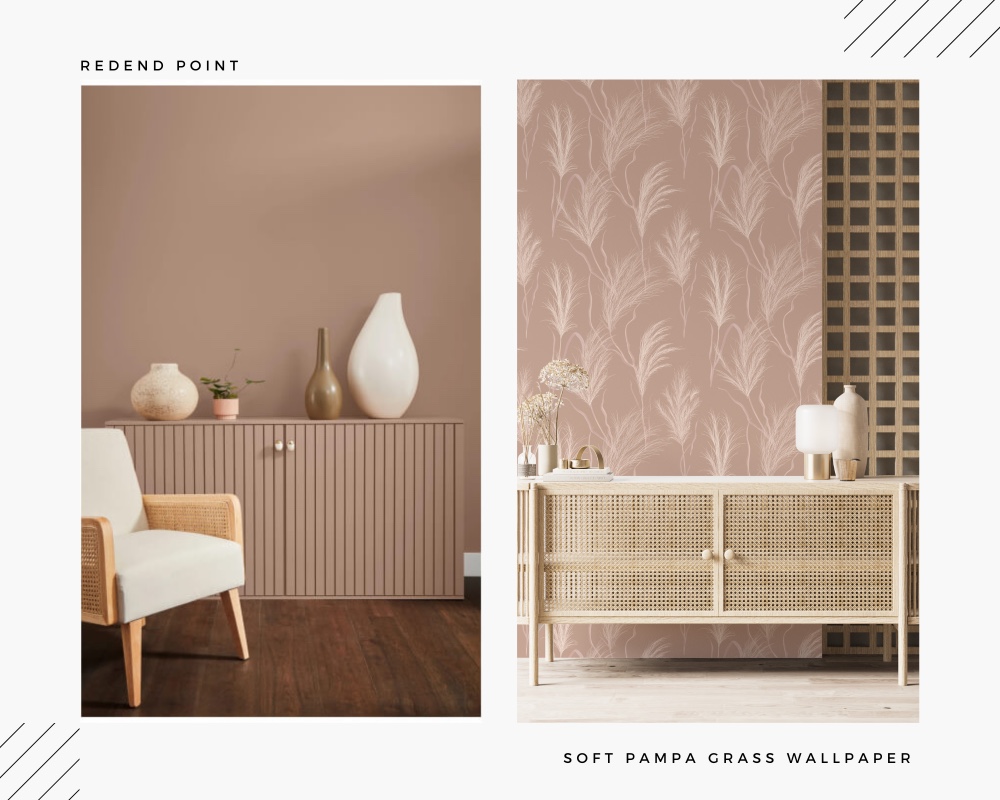
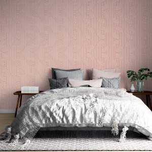
Redend Point by Sherwin-Williams’s
Warm, modern mauve that embodies a timeless elegance. The company has forecasted that earthy hues are about to rule the interiors in 2023. They even came up with a palette TERRA which features 40 nature-inspired hues.
We suggest: Soft Pampa Grass Wallpaper
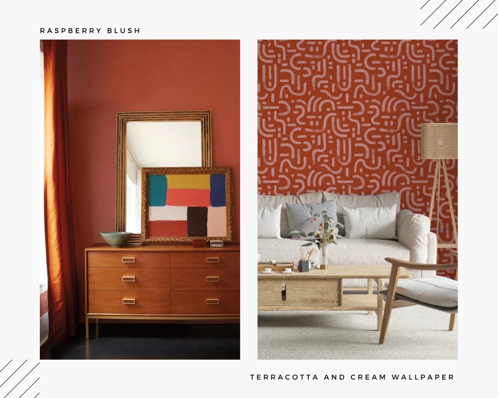
Raspberry Blush by Benjamin Moore
Benjamin Moore chose a brighter approach for the next year with a coral-tinged happy color. With this hue they declared stepping out of a color comfort zone where we ‘re all been since the pandemic kicked in.
We suggest: Terracotta and Cream Wallpaper
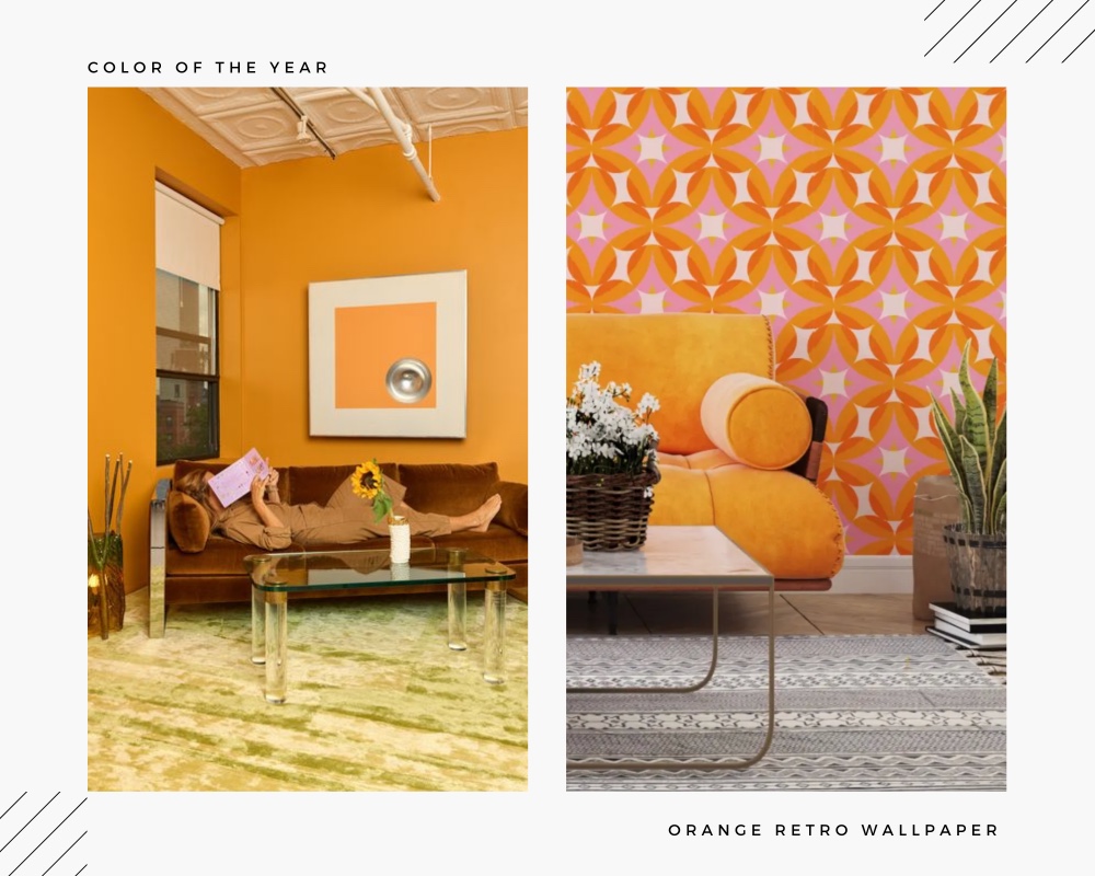
Color of the Year by Backdrop
This is an ironic comeback to the color forecasting when every paint company declares it’s their duty to come up with their own prediction. The brand released a brand new color which goes with this tongue-in-cheek name.
We suggest: Orange Retro Geometric Wallpaper
Explore our Suggestions for Bright Wallpapers:
-
 Terracotta Rustic Self Adhesive WallpaperFrom: $17
 -
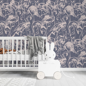 Blue Flamingo WallpaperFrom: $17
 -
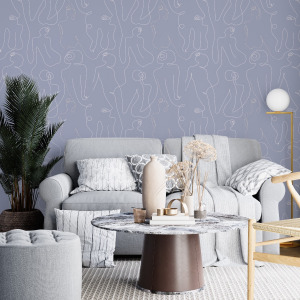 Lavender Body Lines WallpaperFrom: $17
 -
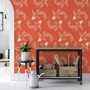 Orange Koi Fish WallpaperFrom: $17
 -
 Mint Geometric Wallpaper GEO STARFrom: $17
 -
 Pink Art Deco Wallpaper – Rose BlushFrom: $17